Logo
Primary logo
The brandmark design consists of Productive’s recognizable checkmark and brand name.
Secondary logo
The white mark is used on a black or color background.
What to avoid when using our logo
Color
The logo and mark shouldn't be used in any other color besides the ones above. Examples of how not to use the logo and mark are below.

Size and Position
Different relations between the mark and the logo/type are not allowed. The logo must be resized proportionally.
What to avoid when using our logo

Correct
When mentioning our company use the name "Taskip".

Incorrect
Avoid making these spelling mistakes: taskip.net, taskip.app, taskipapp and similar variations are all incorrect and shouldn't be used.
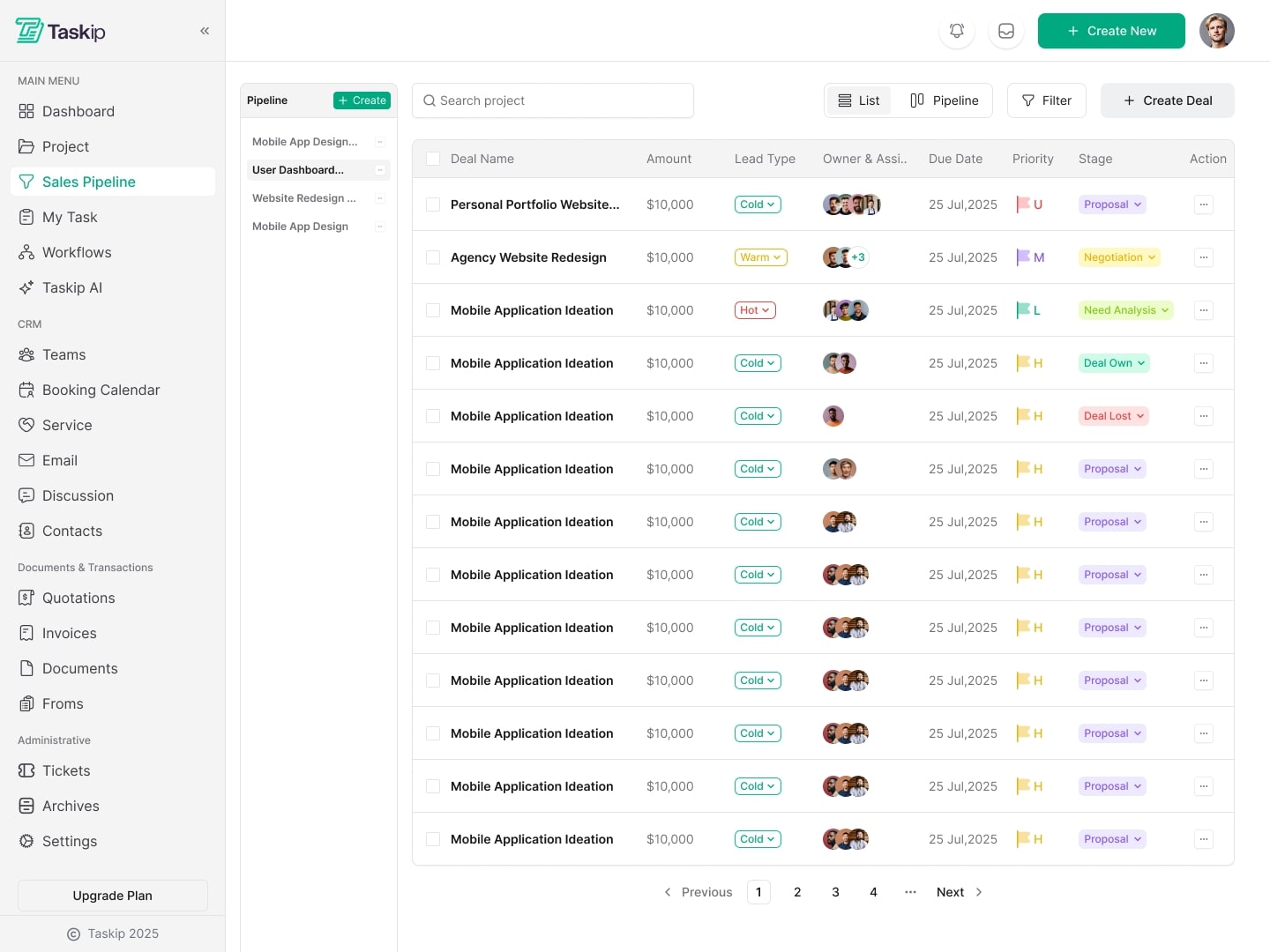
Product Screenshots